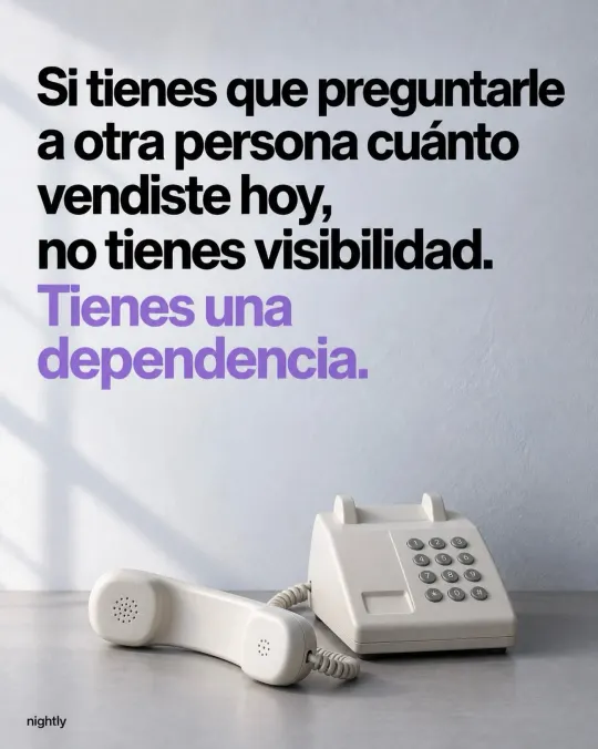
Business software design: why “it works” isn’t enough
If finding an order takes help, the problem is still there. Why ease of use in your business software shows up as time, errors and training, and how to ask for it.
Why did we accept that work software had to be hard to use?
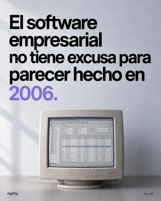
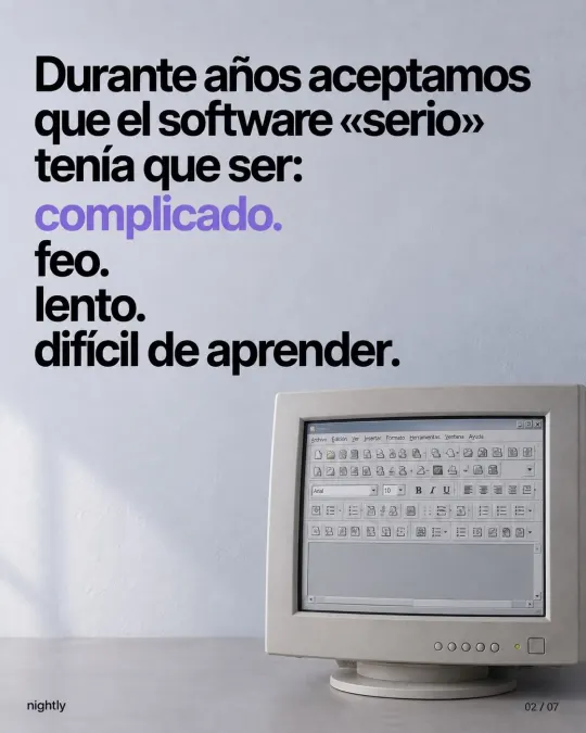
For years, we accepted that “serious” software had to be complicated, ugly, slow and hard to learn. Often the person who bought it wasn’t the person who used it: the feature list got reviewed, not what it feels like to enter a hundred orders a day. Teams adapted however they could, with sticky notes on the monitor, a spreadsheet on the side and the usual line: “Ask Juan, he knows.”
The data backs this up. In MeasuringU’s benchmarks, business software averages 66 out of 100 on the SUS ease-of-use questionnaire (a C grade), compared with 75 for consumer software (a B grade). Their 2025 business software study sums it up: B2B software tends to be more complex and difficult to use than consumer software. Meanwhile, your team uses banking, messaging and shopping apps every day that don’t need a manual.

What’s wrong with a system that “works”?
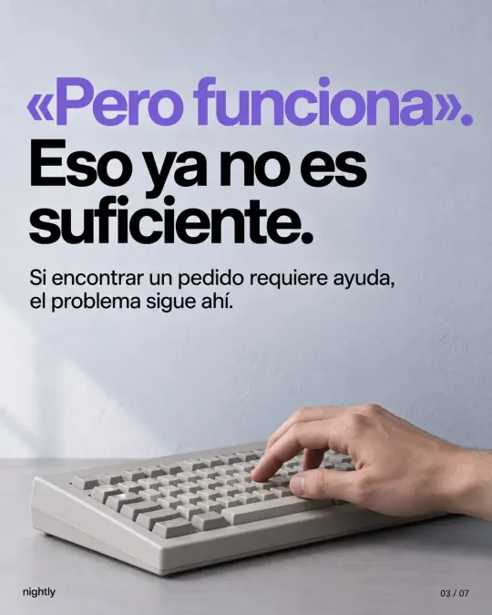
“It works” only means the data gets saved. A system can save an order correctly and still make you waste time looking for it. It can have every feature and still leave you with the same question: what do I do now? If finding an order takes help, the problem is still there.
That’s why ease of use is part of quality, not an extra. Nielsen Norman Group, a user experience research firm, defines usability with five components: how easy it is to do a task the first time, how quickly you can do it once you’ve learned, how easily you get back up to speed after time away, how many errors you make and how serious they are, and how pleasant it is to use. On company intranets, Jakob Nielsen puts it bluntly: usability is a matter of employee productivity, because the time people waste getting lost or puzzling over difficult instructions is money you pay without getting work done.
What does hard-to-use software cost your business?
More than it seems, because the cost arrives in small pieces. If your team spends eight hours a day in your software, every bit of friction repeats all day long. For example: if entering an order takes 40 extra seconds and your team enters 60 orders a day, that’s 40 minutes a day, more than three hours a week, on a single task.
| What the system should save you | How it shows up today | What it costs you |
|---|---|---|
| Clicks | Five screens for an everyday task | Minutes that add up every shift |
| Doubts | “What’s next?” “Did it save?” | Interruptions and reliance on the one person who knows |
| Errors | Wrong customer, duplicate order, mistyped price | Corrections, returns and frustrated customers |
| Learning time | Weeks before a new hire can work alone | Training and extra load on everyone else |
| Waiting | Screens that take a while to load | People lose their train of thought or switch to something else |
Speed is part of design too. According to Nielsen Norman Group, a response within a tenth of a second feels instantaneous; up to one second, people keep their flow of thought even though they notice the delay; past ten seconds, they want to do something else while they wait.
And there’s a cost that never shows up in a table: when the system gets in the way, people work around it. They go back to spreadsheets and WhatsApp, and the information stops being reliable. A system your team avoids won’t organize your operation, no matter how many features it has.
What makes business software well designed?
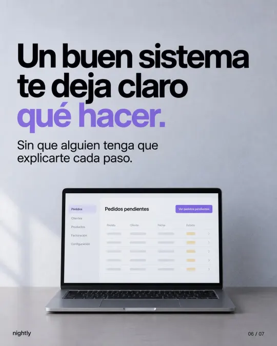
A good system makes it clear what to do, without someone having to explain every step. That gets decided in concrete details: the names on the buttons, what shows up first and how the system helps you avoid a mistake. These are the usability principles from Jakob Nielsen that matter most in day-to-day operations, in plain terms:
- It shows you where things stand. After you save, it confirms the work was recorded and shows the status of each order.
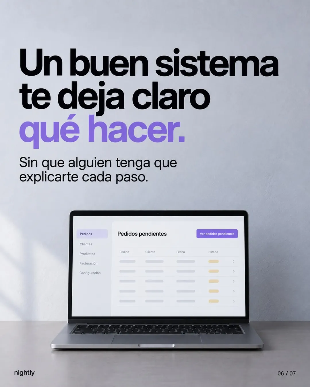
- It speaks your team’s language. “Pending orders,” not “Module SO-02.” Your company’s words, not the developer’s.
- It puts what matters first. When people sign in, they see what they do every day, not forty options.
- It prevents errors before they happen. It won’t accept an impossible date, flags orders that look like duplicates and asks for confirmation before canceling.
- It doesn’t make you memorize. It shows the options instead of asking you to remember codes.
At TramitesLegalesMX, for example, each service asks for exactly the information and files it needs, and customers confirm requirements, balance and details before they pay. That’s one way to prevent an error before it happens.
How can you tell if your current system is costing you?
You don’t need an expensive study. Try this for a week:
- Watch a common task. Ask someone to find an order or record a sale while you watch, without helping. Count the steps and note where they hesitate.
- Count the questions. Write down how often someone asks “How do I…?” or “Where did that order go?”
- Look for workarounds. Side spreadsheets, sticky notes on the monitor, entries that get double-checked over WhatsApp.
- Review recurring errors. Duplicate orders, wrong customers, cancellations caused by data-entry mistakes.
- Measure how long it takes a new hire to work without help.
- Run a short survey. The SUS questionnaire has ten questions and produces a score from 0 to 100. According to MeasuringU, the average across more than 500 products is 68: if your system scores lower, your team finds it harder to use than the average product.
If several of these show up, the problem isn’t your team. It’s the system’s design.
What should you ask for when you commission a system?
Design gets agreed on in the proposal, not at the end. Ask for this:
- Time spent watching your team work before anything gets designed, not just a conversation with you.
- Screens before code. At Translate3D, the whole experience was designed before any code was written.
- The shortest path for the most frequent tasks. Ask how many steps it takes to enter an order.
- Your company’s words on buttons, statuses and reports.
- Safeguards against the errors that cost you the most, like a price outside the normal range or an order with no delivery address.
- Testing with your team before each delivery: someone does the task without help, and whatever gets in the way gets fixed.
- A version that works on phones if you have people on the shop floor, in the warehouse or on the road.
For everything else, like what happens to your data, who has access and how support works, see 10 questions to ask before you hire a custom software company.
Is good design just about looking good?
No. Design isn’t decoration. It’s also operational infrastructure, like the layout of a warehouse or a production line: it decides how fast and how safely work flows. A beautiful screen that hides the next step is badly designed. A plain screen that makes the next step clear is well designed. Anyone who uses a tool every day deserves to find what they need, understand the next step and know their work was saved.
That’s how we see software at Nightly. If your team fights every day with a system that “works,” let’s talk. In a free consultation, we look at how your team works, which tasks get complicated and what to fix first. See how we approach custom software development or book your consultation. Pricing depends on scope, and we send it to you in writing after the consultation.
Related
Frequently asked questions
It’s how easy software is to use to get the work done. It shows up in five things: how quickly you learn it, how fast you work once you know it, how easily you pick it back up after time away, how many errors you make and how pleasant it is to use.
Often, yes. Start with the most repeated tasks and the screens where people make the most mistakes. If it’s off-the-shelf software, you may only be able to change its settings. If it was custom-built, ask whoever maintains it which screens can be redesigned in stages.
Involve them from the start: have the provider watch them work, let them try the screens before each delivery and make sure the first stage takes away a task that bothers them today. A system that saves work from day one is much easier to adopt.
Sources
- Usability 101: Introduction to UsabilityJakob Nielsen, Nielsen Norman Group
- 10 Usability Heuristics for User Interface DesignJakob Nielsen, Nielsen Norman Group
- Response Times: The 3 Important LimitsJakob Nielsen, Nielsen Norman Group
- Setting Metric Targets in UX Benchmark StudiesJeff Sauro, MeasuringU (2018)
- Business Software UX & NPS Benchmarks (2025)Jeff Sauro and Jim Lewis, MeasuringU
Based on our post on Instagram.
Last updated: